Taverne DesBois

As a graphic and web design student, I was tasked with designing the branding for a fictional coffee shop, restaurant, or bar. I chose to create a bar where the main attraction would be a place to play board games.

Process

I developed three personas representing the brand’s target demographic. My personas ranged from young, child-free adults to middle-aged adults with independent children, all of whom were looking to escape the monotony of everyday life. I was also tasked with creating an infographic.

Logo

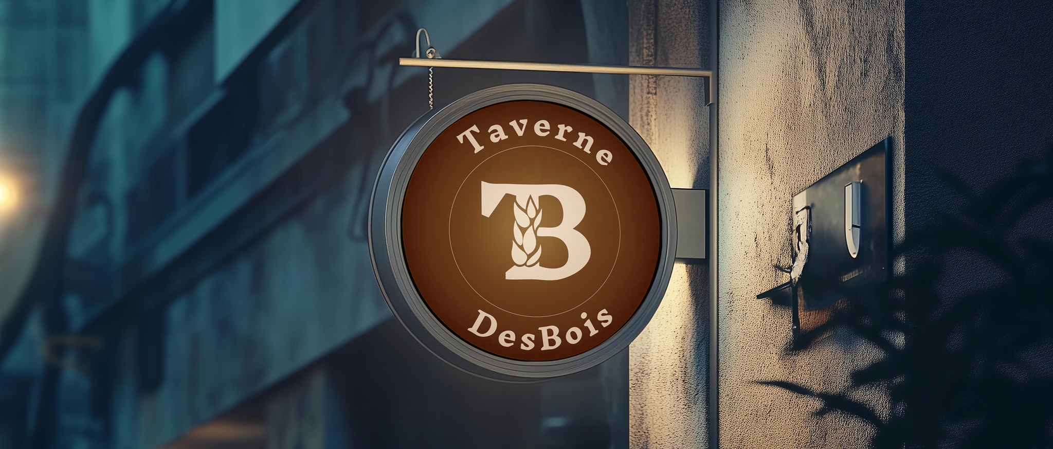
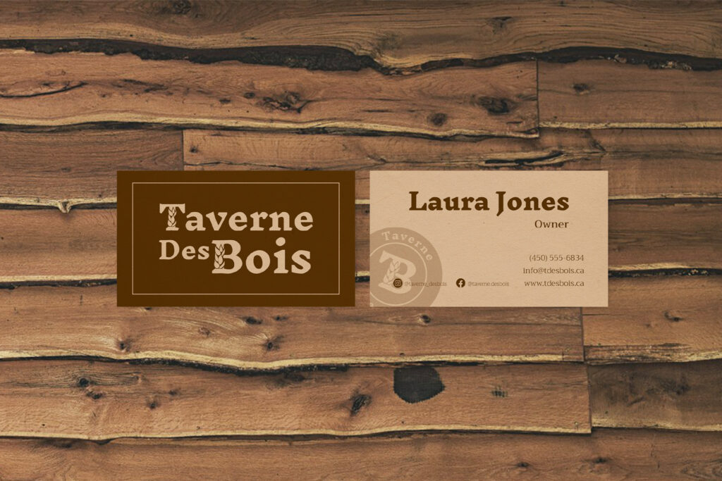
 I had to name my fictional business in a way that complied with Quebec’s language laws, so I came up with Taverne DesBois. The final logo is based on Inknut Antiqua in the extra-bold weight. The stems of the “T” and “B” are replaced by leaves, as quintessential depictions of fantasy are often set in medieval times, when people were much closer to nature than modern city dwellers. The “Des” is scaled down and reduced in size to de-emphasize it.

Colour Palette

The color palette features warm browns reminiscent of wood and beige tones like aged paper, giving it an old-timey feel.

Typeface

The first step in designing the logo was a font exploration in which I tested twenty serif typefaces. I knew that a company aiming to evoke a fantasy aesthetic needed a serif typeface. I found that Inknut Antiqua resembled dip pen lettering while remaining legible. I chose the extra-bold weight to convey an old manuscript feel. However, I knew that this typeface would not be the most readable for longer or smaller texts, so I selected Trirong for those instances.

Submark and Favicon

The submark is round to resemble a wax seal stamp. Since the stems of both the “T” and “B” are leaves, they have been combined into the Taverne DesBois symbol, which became the favicon.

I incorporated the submark on the business card to tie the design more to the idea of a wax seal stamp. The typefaces, colour choices, and contrast create unity through repetition of the brand elements.

For this project, we also had to create an ad. I used a different typeface for the title to evoke an old medieval feel. I illustrated people disguised as fantasy creatures having fun around a table to show our target demographic the essence of what Taverne DesBois is about. Once again, the submark was used to emphasize the wax seal stamp concept.